The centre lines
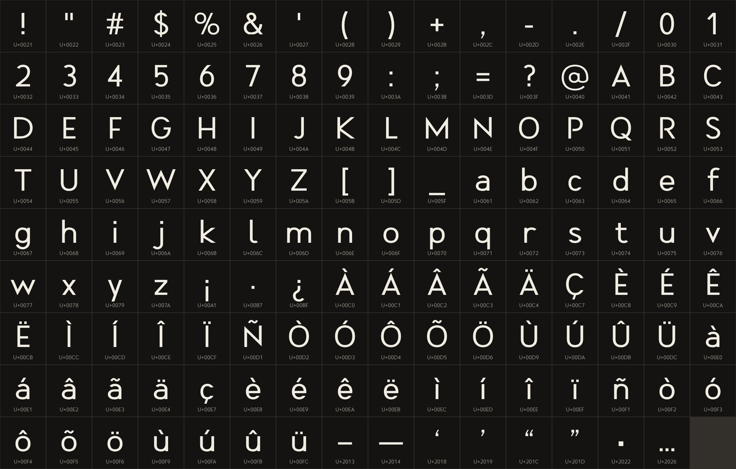
143 letters, figures and marks, each a few lines of code built from the monogram’s rules.
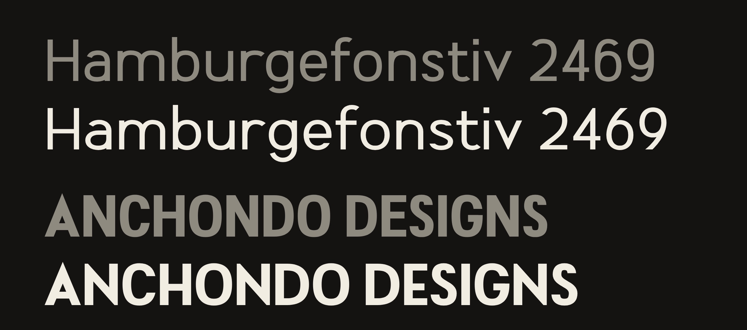
The brief was one line: a font for Anchondo Designs that nobody else has. Two days later there were three families: a headline face, a double-line accent and a text family in twelve styles. Every letter was drawn in code from the A and D of the monogram. No existing font was opened, traced or used as a source.
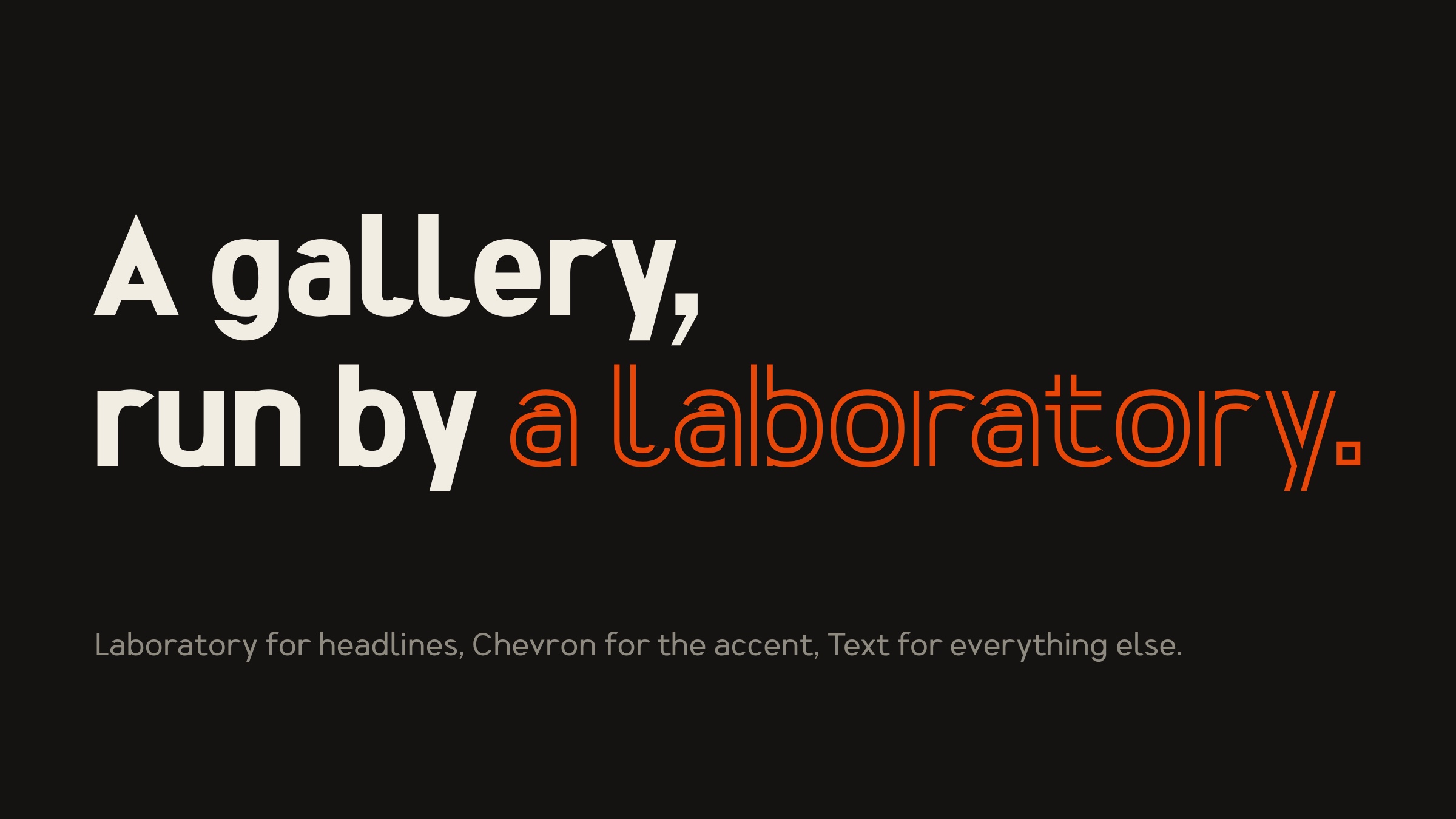
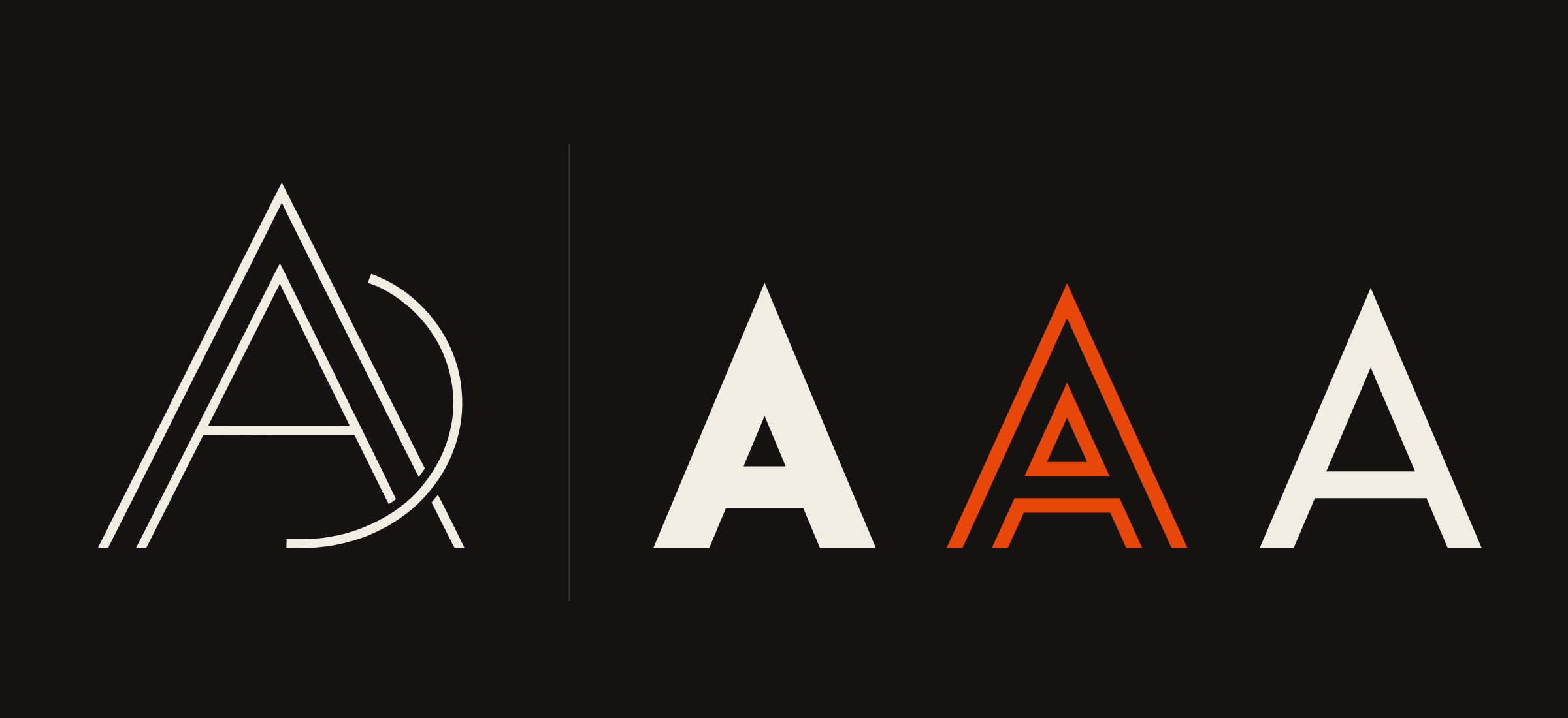
Most custom type starts from a mood board of other fonts. This one started from a single drawing: the Anchondo Designs monogram. Measured, it gave five rules, and every letter in all three families follows them.
The pointed A became the headline face’s signature. The doubled line became a whole accent face. The low crossbar and the free arc carry into the text family, where they’re quiet enough to read for pages.
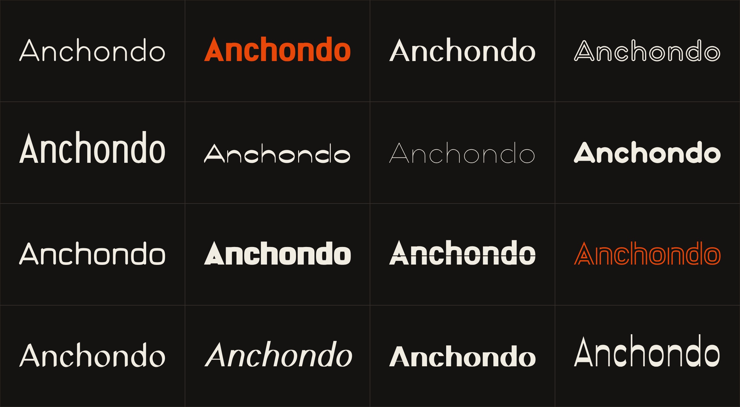
Because every letter is a set of parameters rather than a drawing, a new direction is a new set of numbers. Round one explored sixteen: hairline, poster weight, high contrast, a leaning cut, a level slice through every letter. Each was a complete working alphabet, not a sketch of one word.
Two were picked: Laboratory, heavy and squared, for headlines, and Chevron, Laboratory split into the monogram’s double line, for the accent word. A text face was then drawn to sit under them.
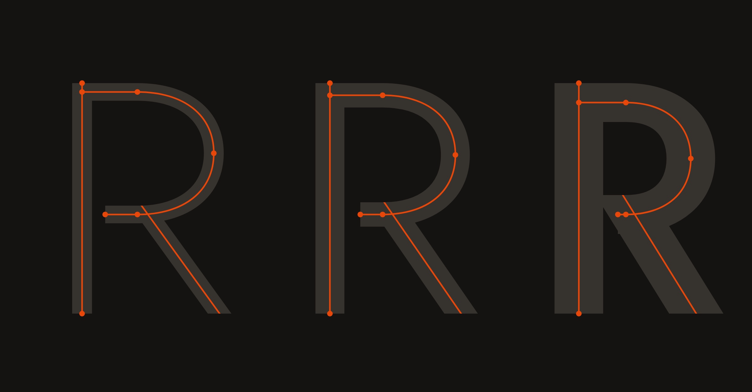
Each letter is written as its centre line: the path a pen would travel. A digital pen then sweeps that line, and the pen’s width and shape decide the weight. The same R becomes Light, Regular or Extrabold without being redrawn.
That’s why a family of twelve styles was possible in a day, and why a fix to one letter reaches every weight at once. The engine, the proofing tools and the font export were all built for this project, in JavaScript and Python.
143 letters, figures and marks, each a few lines of code built from the monogram’s rules.
An adjustable pen sweeps each line. Two drawn weights, Regular and Bold, and four more in between and beyond.
A tool reads the side profile of every letter and writes about 4,000 kerning pairs per style.
Real OpenType fonts for desktop and web, linked as one family so Bold and Italic pick the right drawings.
Drawing from scratch doesn’t guarantee looking new. So every cut went through a font identifier, the tool designers use to name a typeface from a picture. The first text face came back as a close cousin of DIN, one of the most used typefaces in the world.
The fix came from the monogram again: classical letter widths, pointed joins on N, M and K, bowls that stop short of the stem, open endings on c, e and s. On the retest, DIN no longer appeared anywhere near the text face.
| Face | First draft | After the redraw |
|---|---|---|
| Text | DIN 2014 was the top match | No consistent match; DIN absent from the first sixty results |
| Laboratory | DIN 2014 Bold was the top match | Capitals clear; lowercase still under revision |
| Chevron | No consistent match | No consistent match |
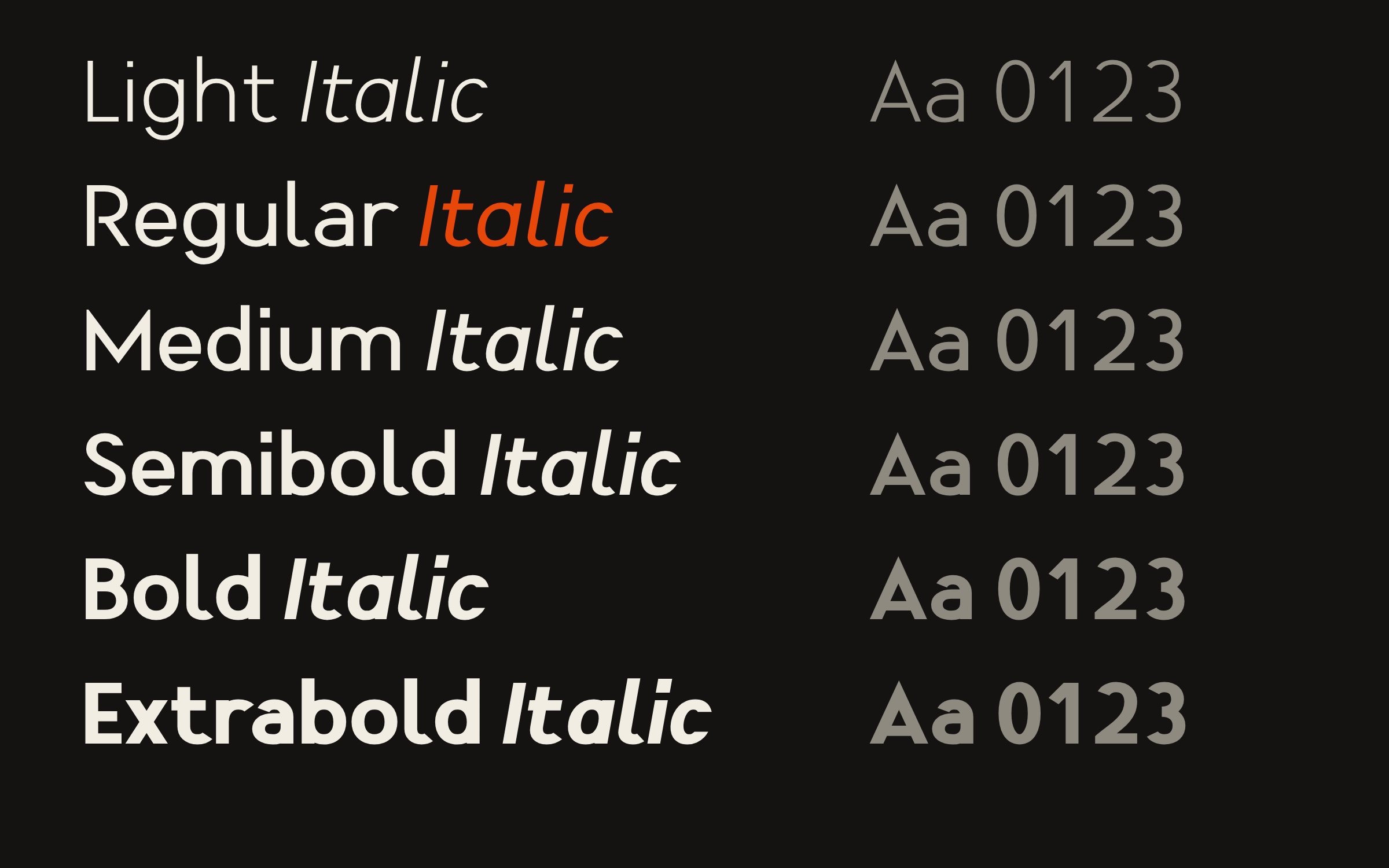
Anchondo Text runs from Light to Extrabold, each weight with its own italic. The italic leans ten degrees and switches to a single-storey a, so it reads as a second voice, not a slanted copy.
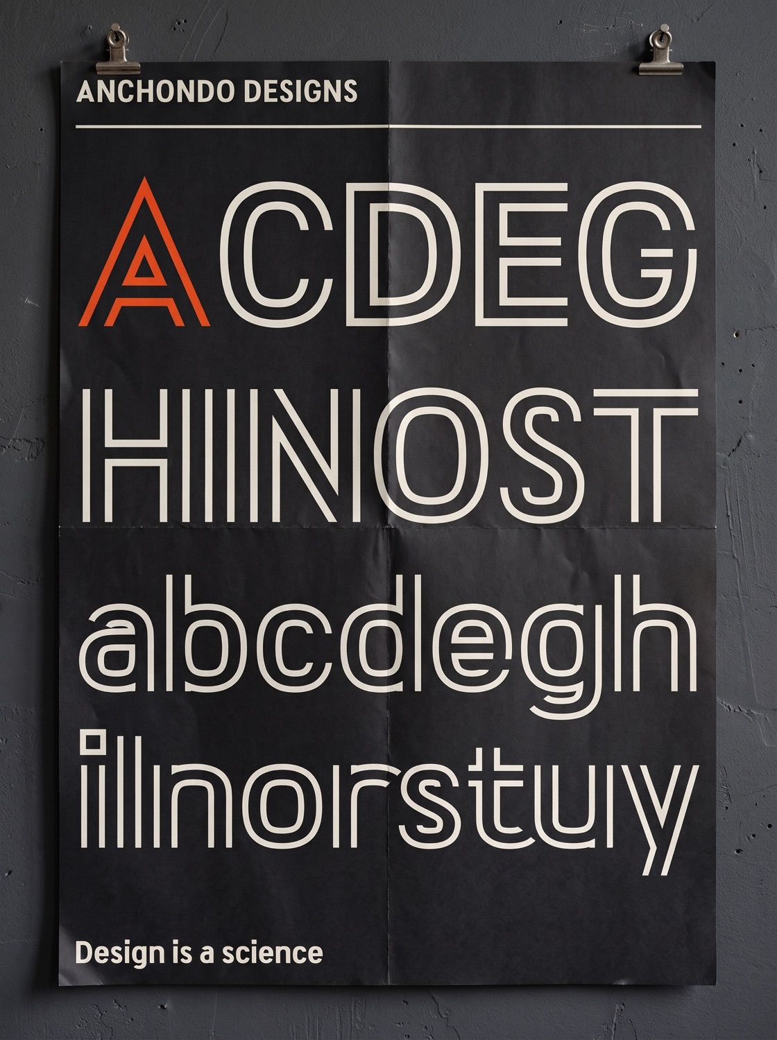
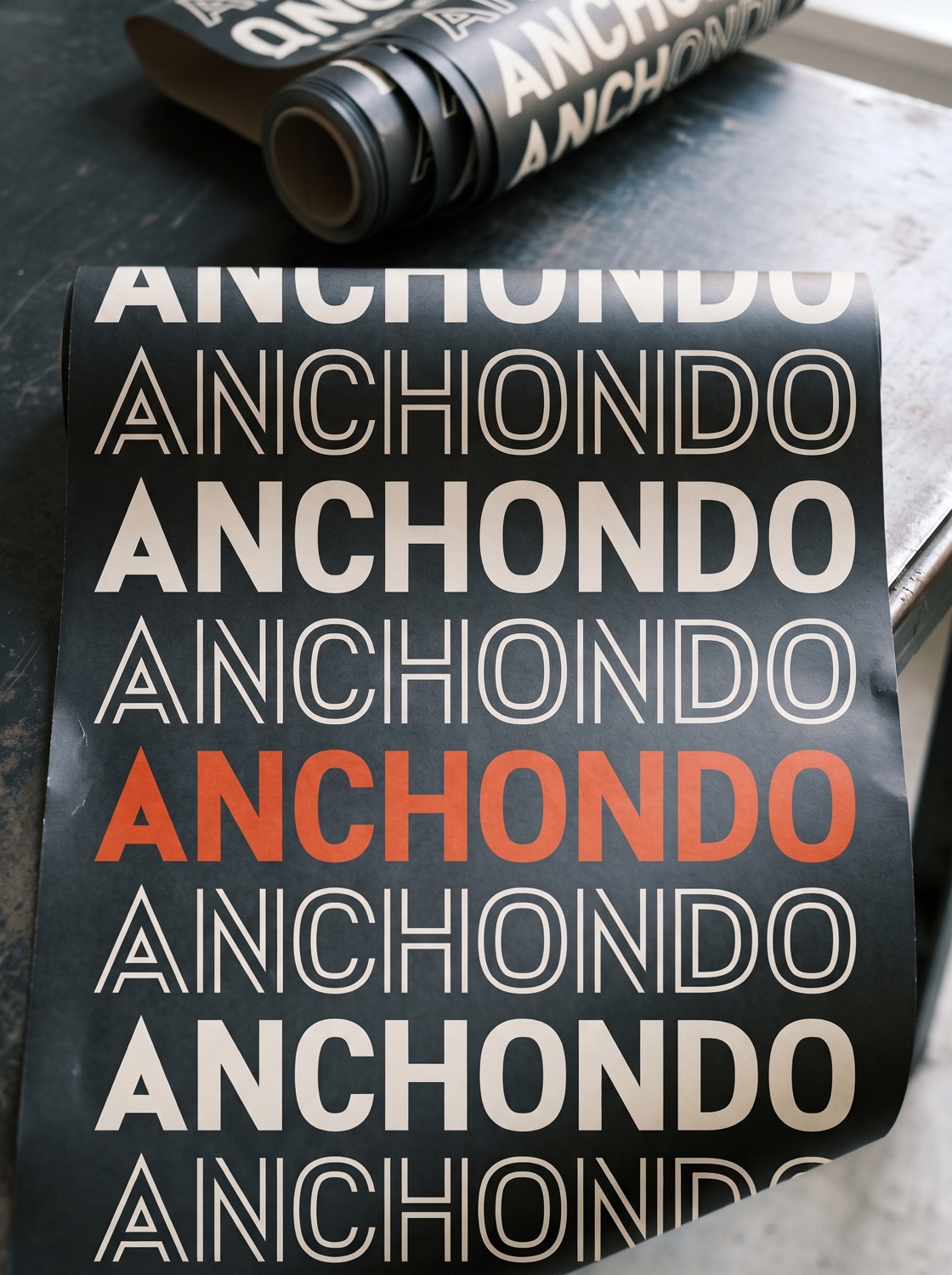
Above it sit the two display faces. Laboratory carries the headline; Chevron, built from the monogram’s double line, carries the one accent word. Three families, one set of rules.
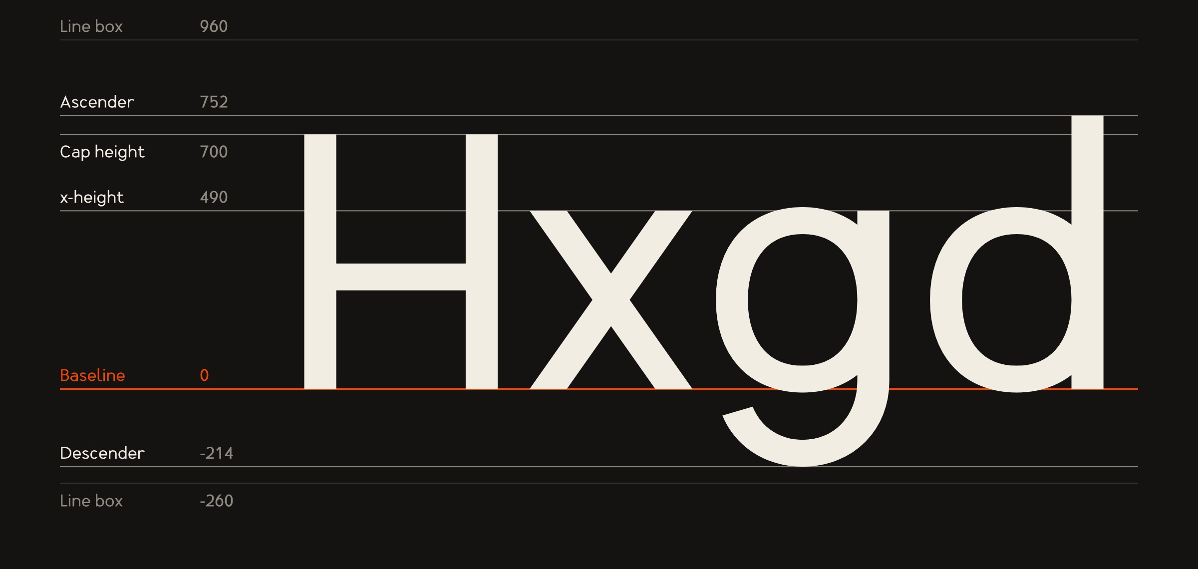
A typeface is only finished when it behaves: lines that space the same on every platform, numbers that line up in a column, Spanish set without a missing accent. Every figure below is read straight from the mastered files, not typed in by hand.
The full technical sheet covers vertical metrics, line height by use, weights, OpenType features, the character set and the files. These are the numbers that matter most.
| Use | Size | Line height | Tracking | Face |
|---|---|---|---|---|
| Body text, web | 16–20 px | 1.5–1.6 | 0 | Text Regular |
| Body text, print | 9–11 pt | 1.4–1.5 | 0 | Text Regular |
| Captions | 12–14 px | 1.45 | +0.01 em | Text Regular or Medium |
| Subheads | 22–40 px | 1.15–1.25 | 0 | Text Semibold or Bold |
| Labels in capitals | 11–14 px | 1.2 | +0.06 em | Text Medium |
| Headlines | 40 px and up | 1.0–1.05 | −0.01 em | Laboratory |
| Accent word | 36 px and up | match headline | 0 | Chevron |
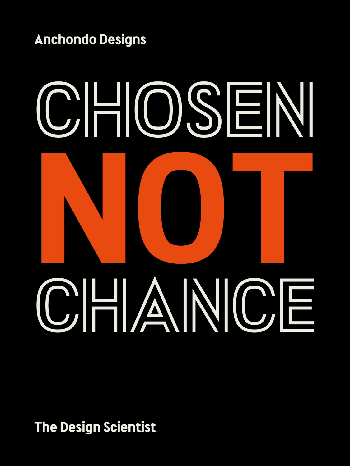
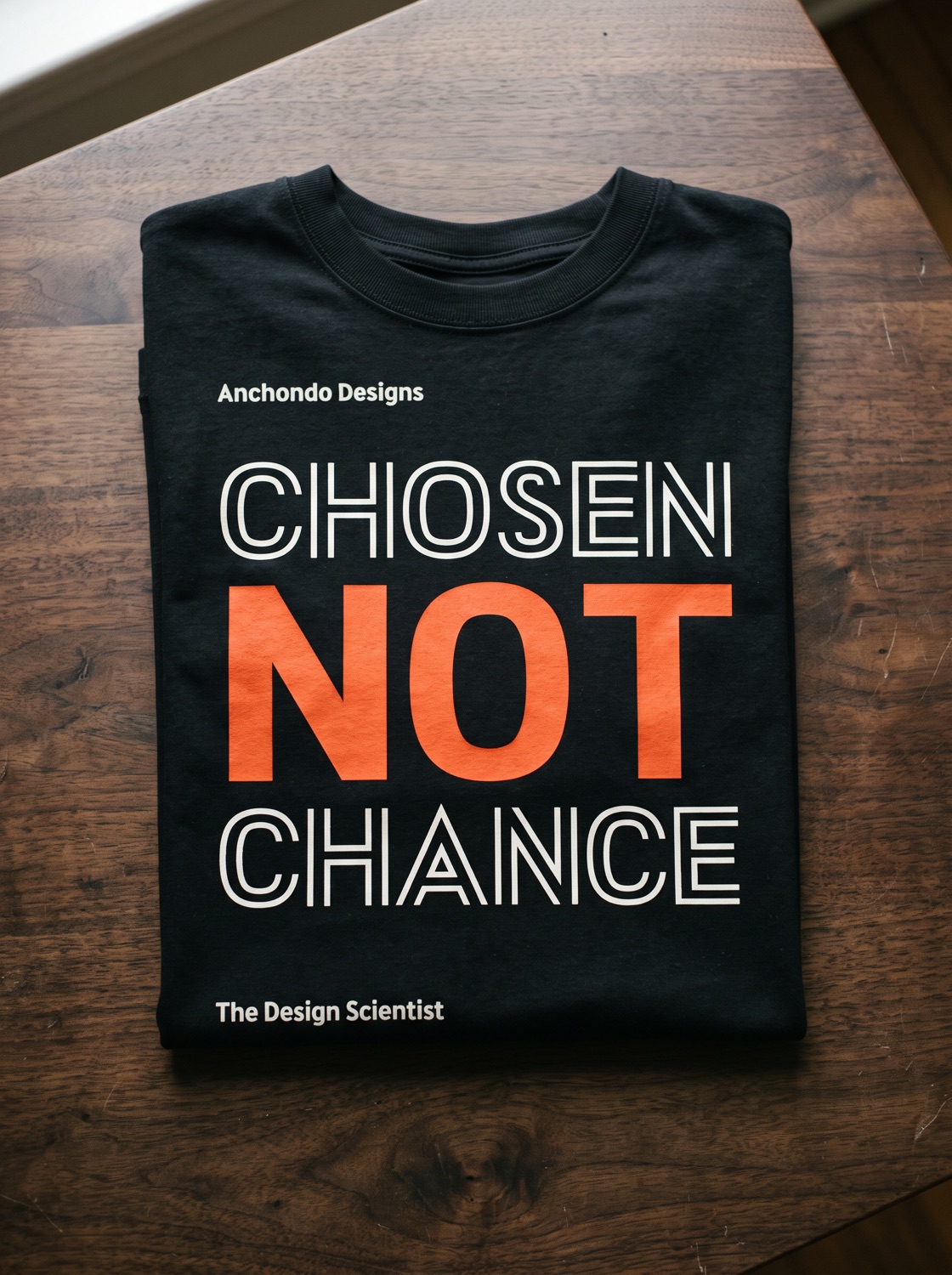
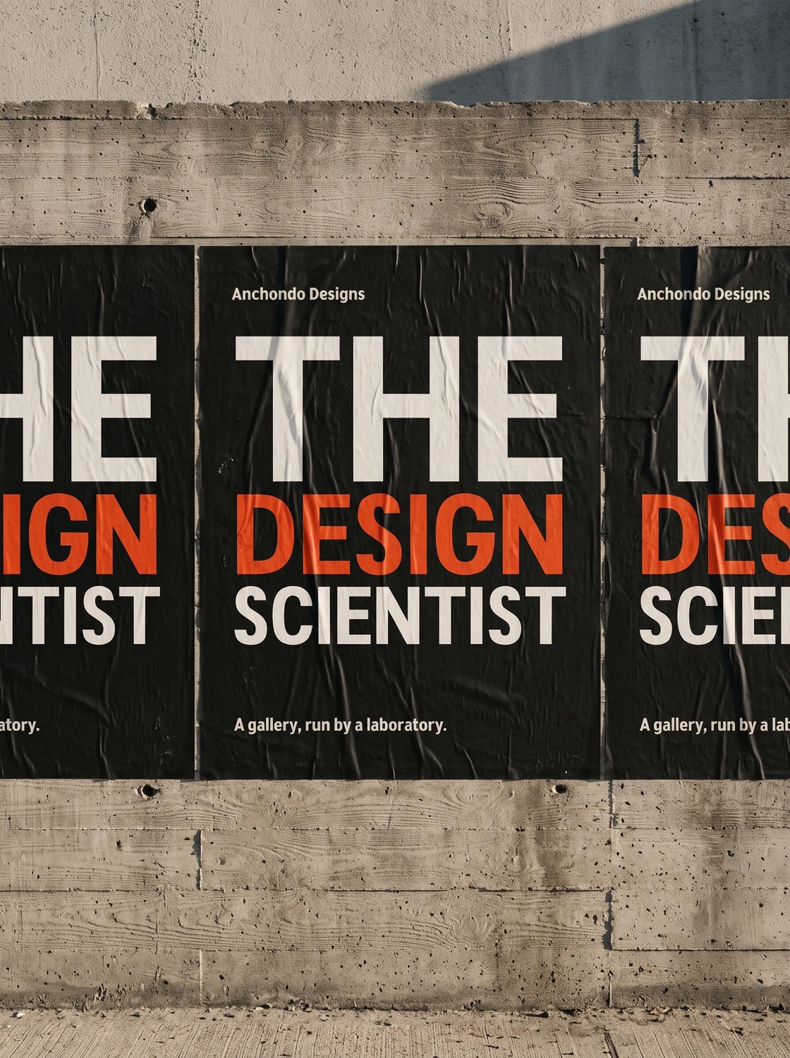
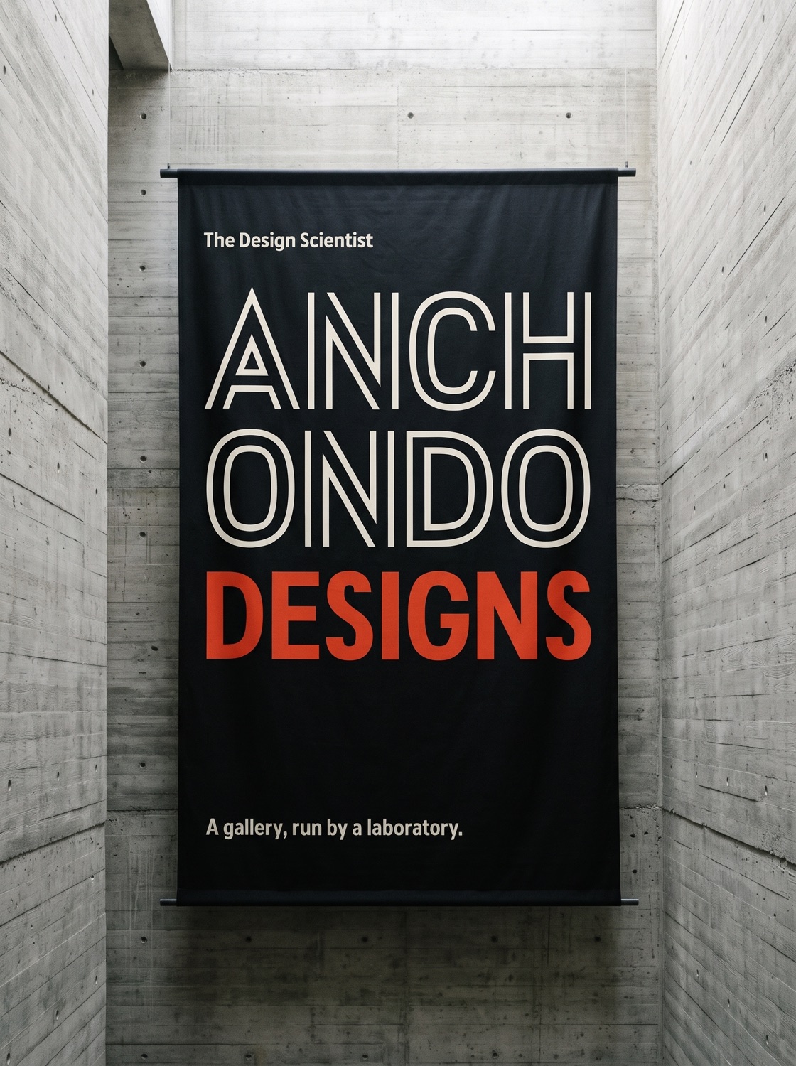
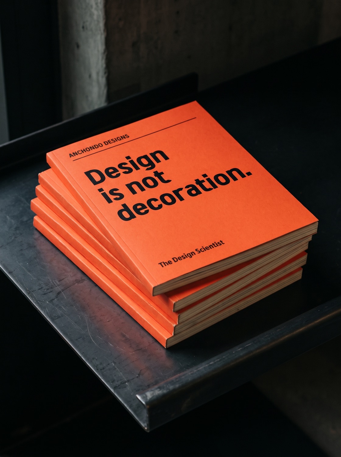
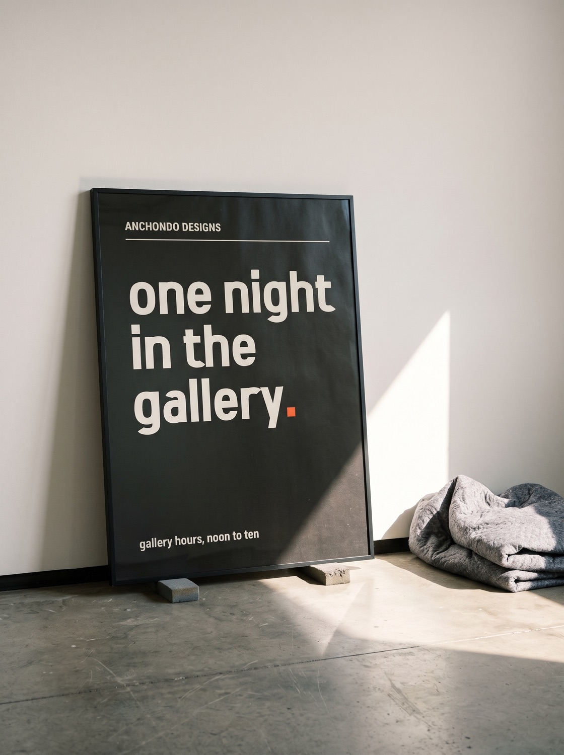
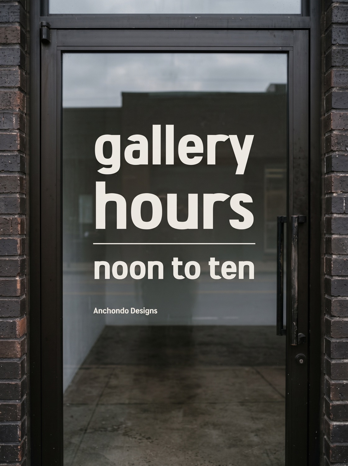
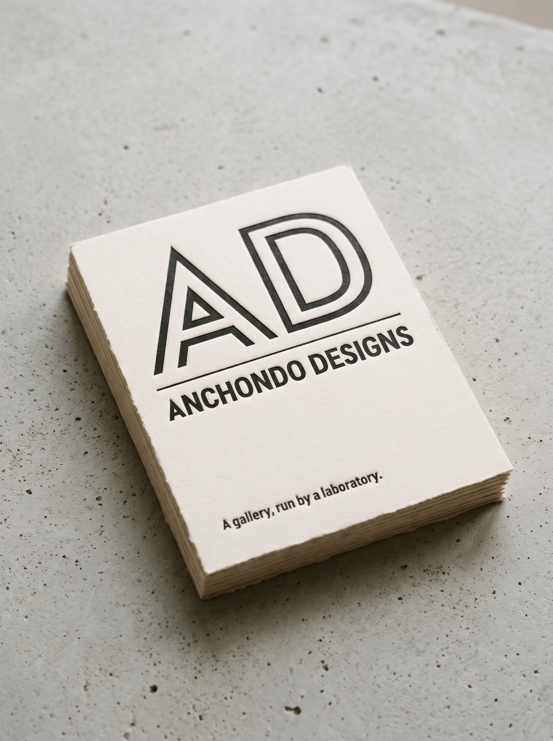
A foundry shows its type working. Each specimen began as a poster set from the real fonts, then went to an image model as the reference for a photographed scene: a wall, a shop door, a shirt, a stack of cards.
These were made in round one, before the redraw, and the model redraws letters as it goes, so small shapes drift. The posters are the true record; the scenes show the feeling.
Custom type used to mean a foundry, a long schedule and a budget to match. Here it meant an art director’s eye, a mark worth building from, and an AI partner that could turn every decision into working code the same afternoon. The fonts are in private testing now, with naming and licensing still to come before they’re released.