work/ · seven exhibits, hung in order
Luxury print editorial. National campaigns for household brands. Conference identities seen by thousands. Investment stories that moved nine figures. Every piece here shipped, and shipped at scale.
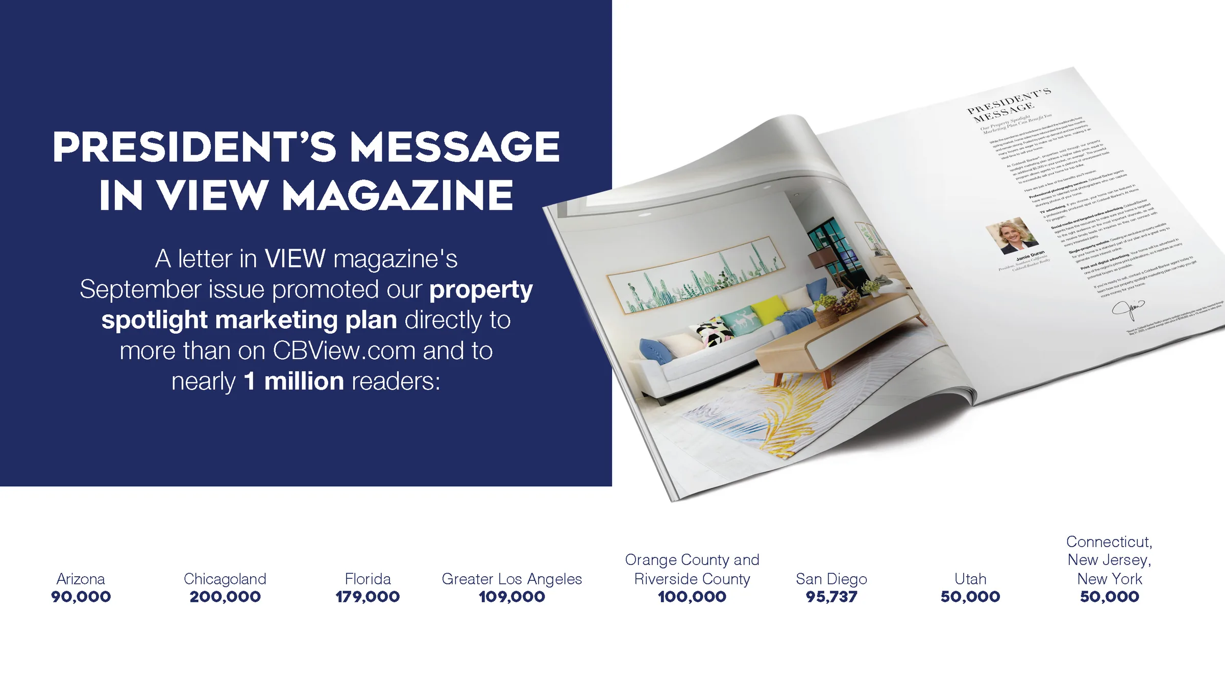
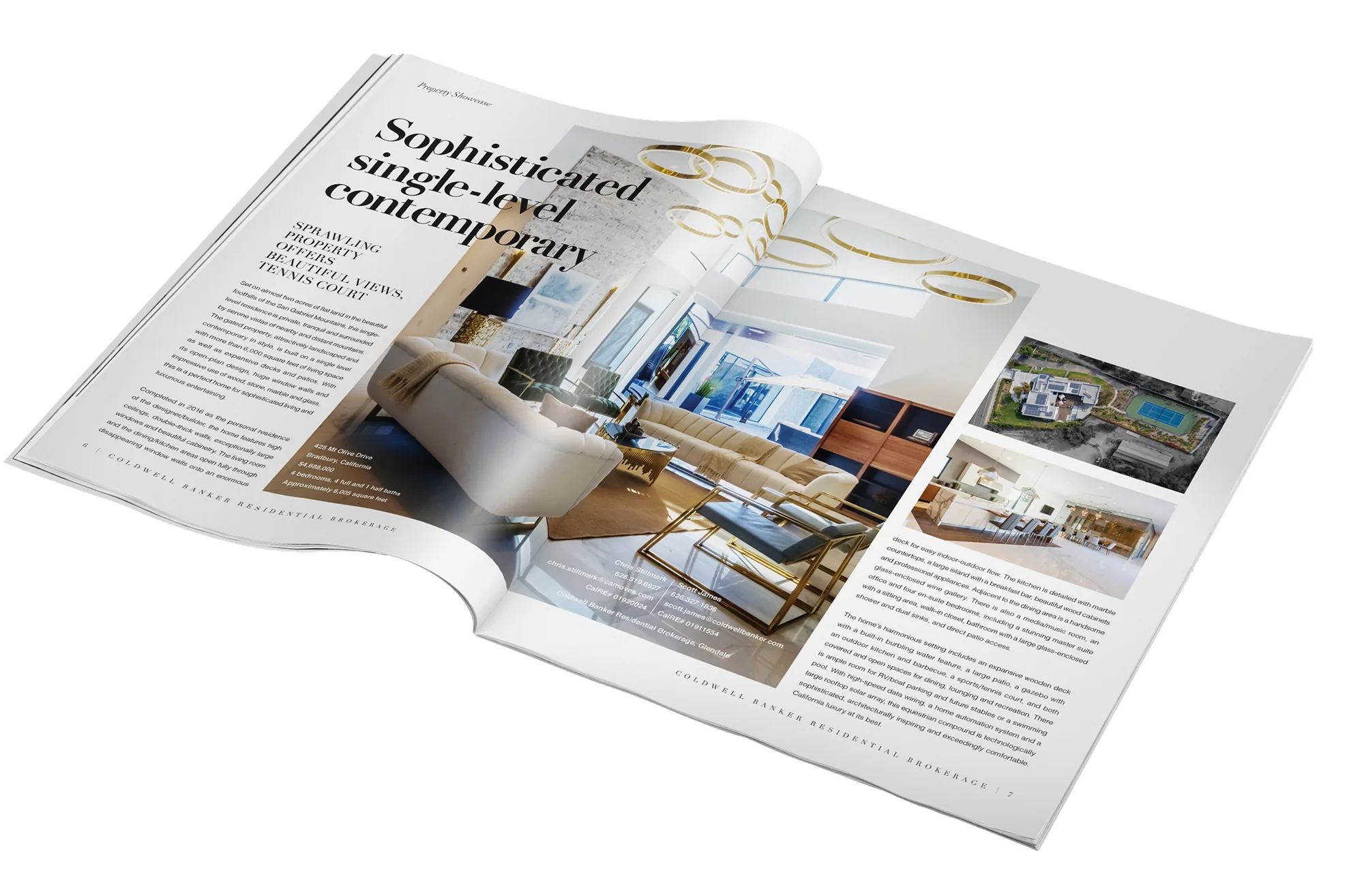
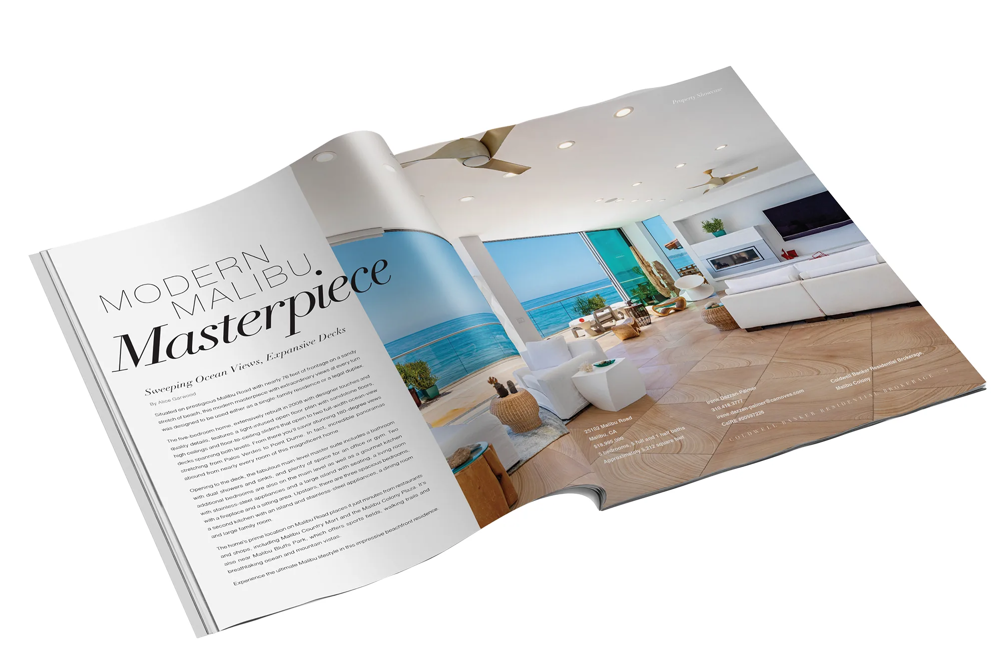
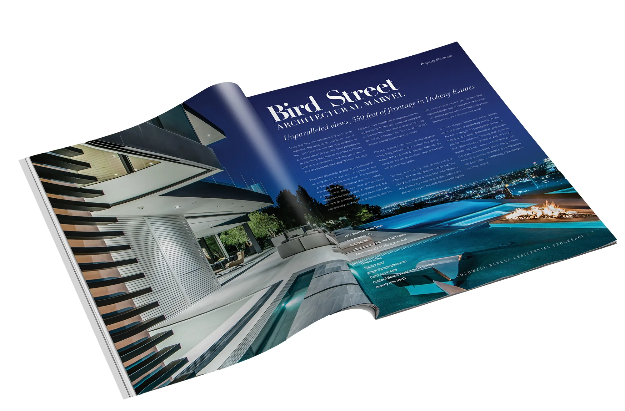
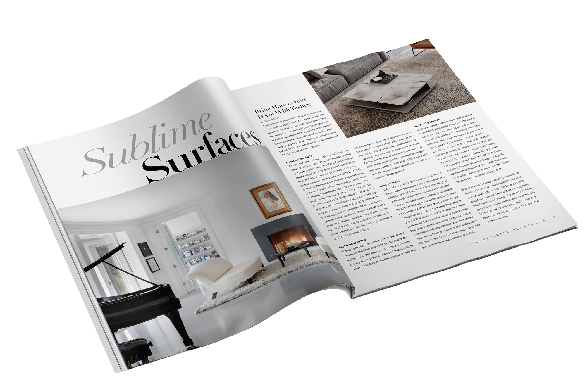
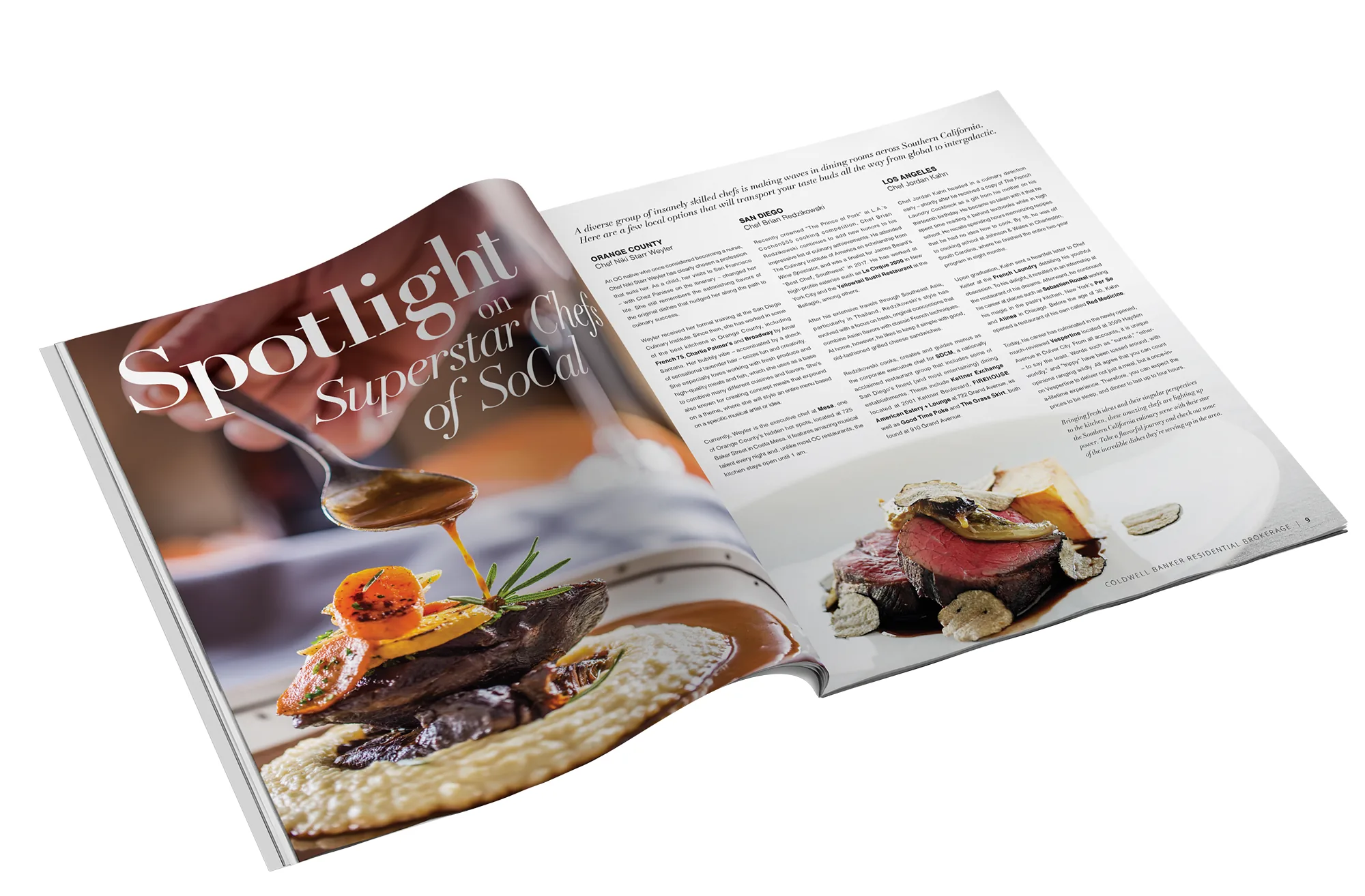
The View was Coldwell Banker's luxury magazine: eight-figure listings, lifestyle features, and an audience that has seen everything. Print for people who own the printing press.
I designed both sides of the book. Property showcases where the typography had to hold its own against $25M architecture: Bird Street's night-lit marvel, the Modern Malibu Masterpiece. And lifestyle editorials like Sublime Surfaces and Superstar Chefs of SoCal, where layout, pacing, and restraint did the selling.
This is the work that taught me a page is a stage. The serif on this site? It learned everything from these spreads.
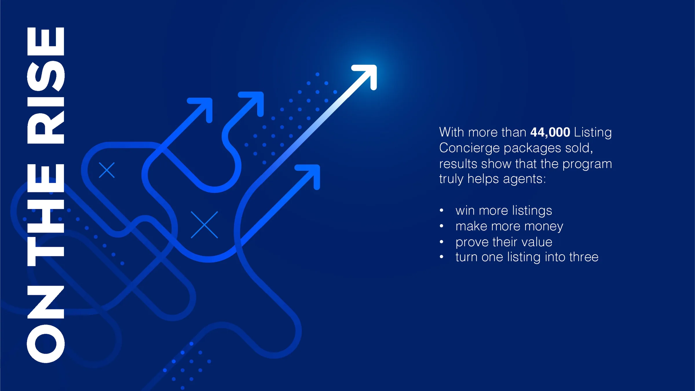
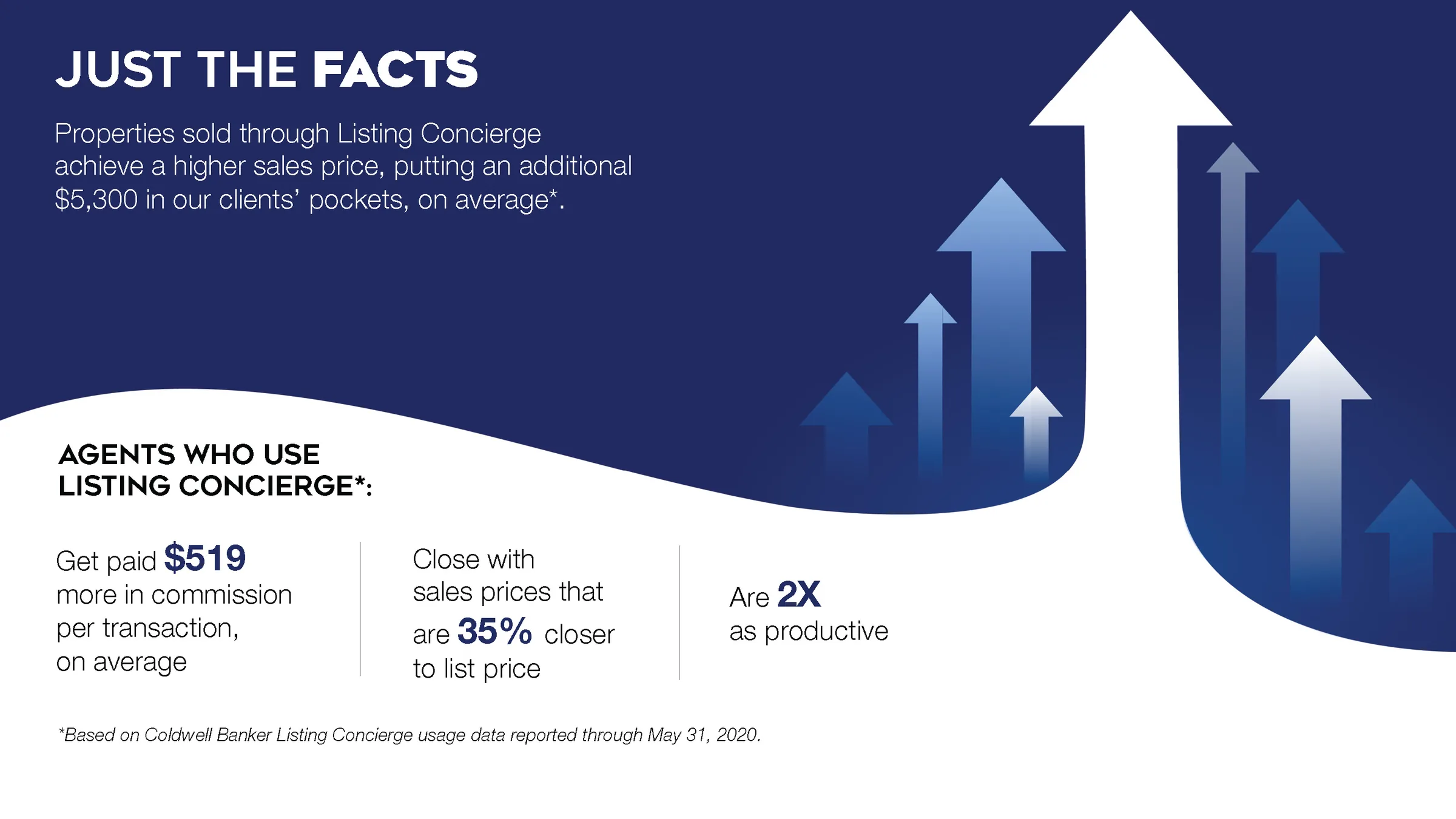
Listing Concierge had the numbers: 44,000+ packages sold, agents winning more listings and turning one into three. What it didn't have was a story sales teams could carry into a room.
I built the campaign around the data itself. A bold stat-first system: deep brand blue, charged arrows in motion, every figure given room to land. Presentations, one-sheets, and recruiting assets all cut from the same cloth.
The program's own results became the creative. Nothing sells like a number set in the right type.


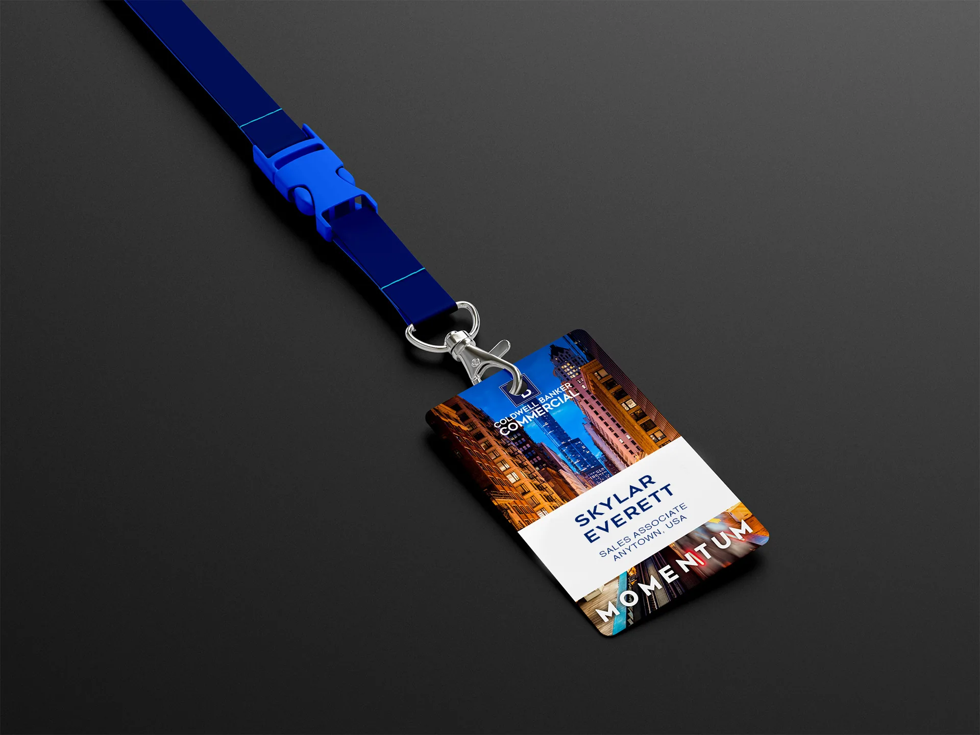
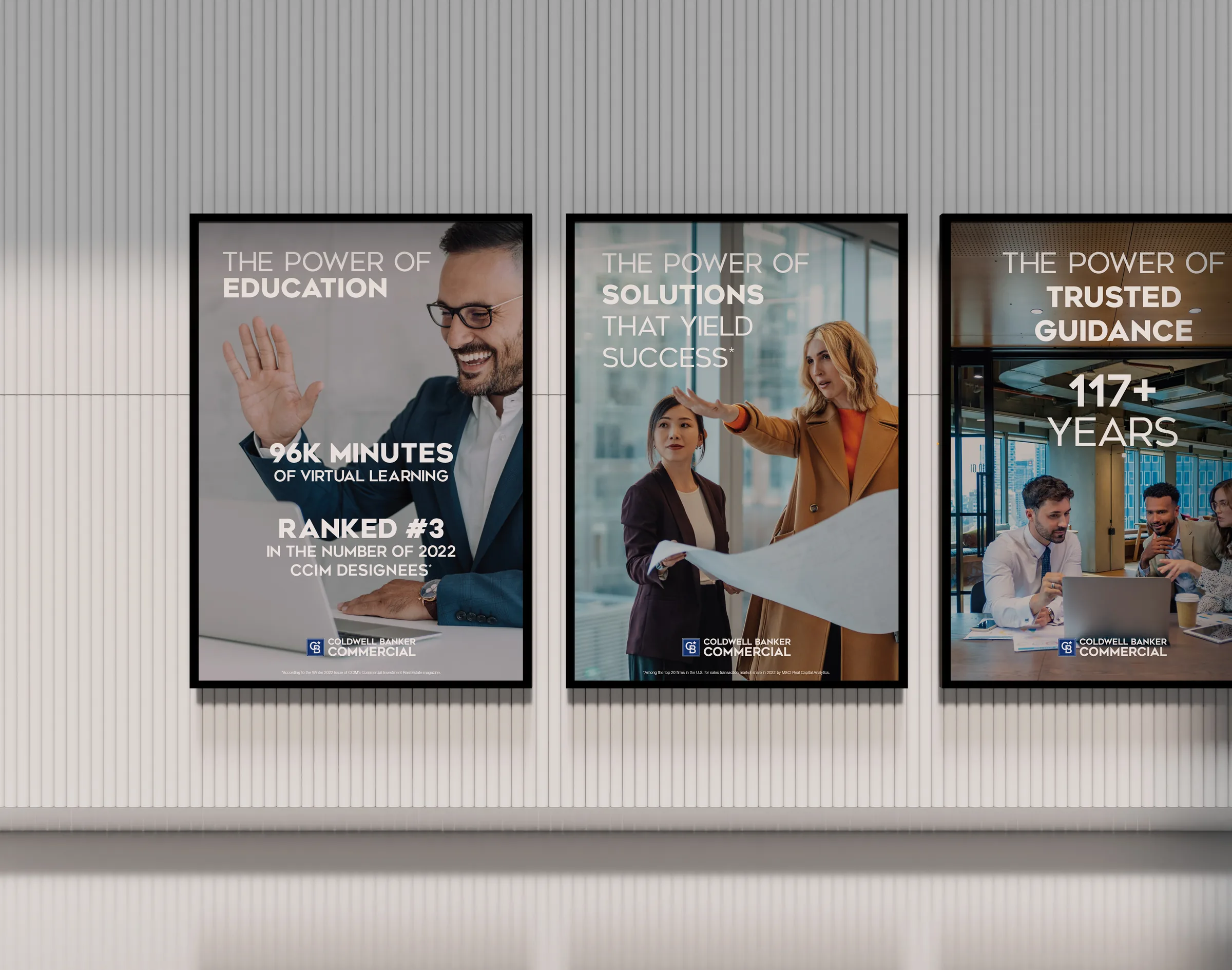
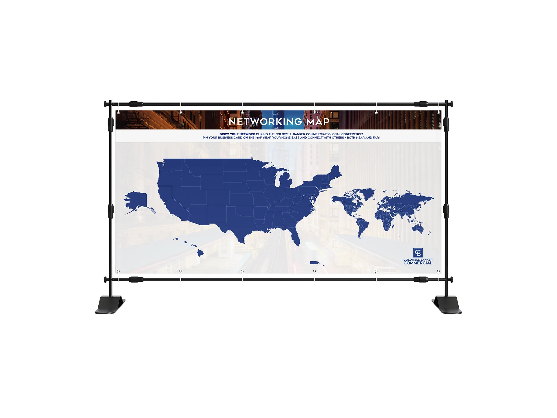
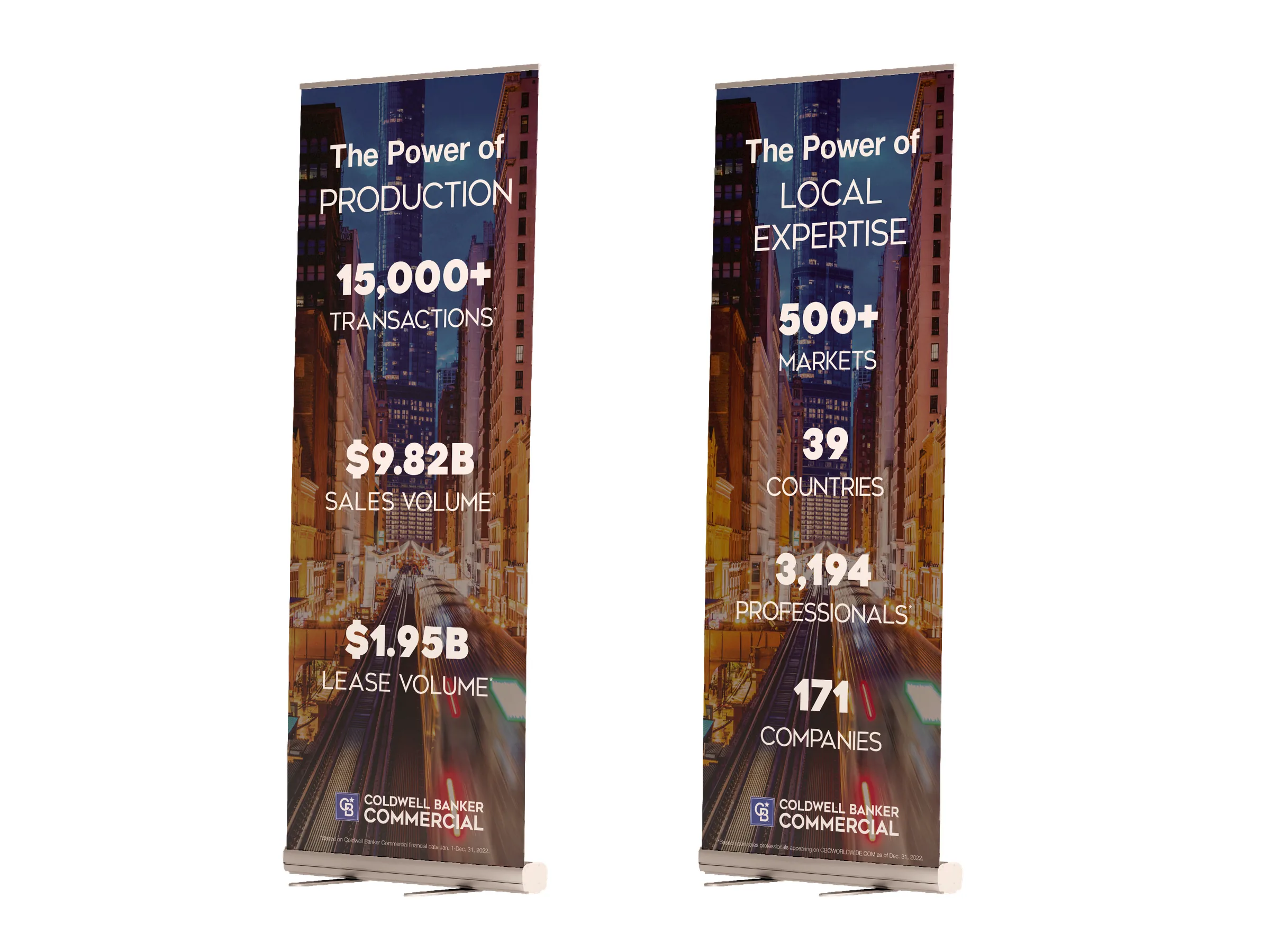
One theme, Momentum, and a global audience arriving with expectations. I led creative for the 2023 Global Conference end to end: main stage graphics, welcome signage, banner systems, networking installations, social assets, and the badge on every chest.
The identity ran on forward motion. Light trails, charging diagonals, city energy. Multiple departments, dozens of stakeholders, one unbroken visual line.
When the lights came up, every surface in the building was saying the same word.


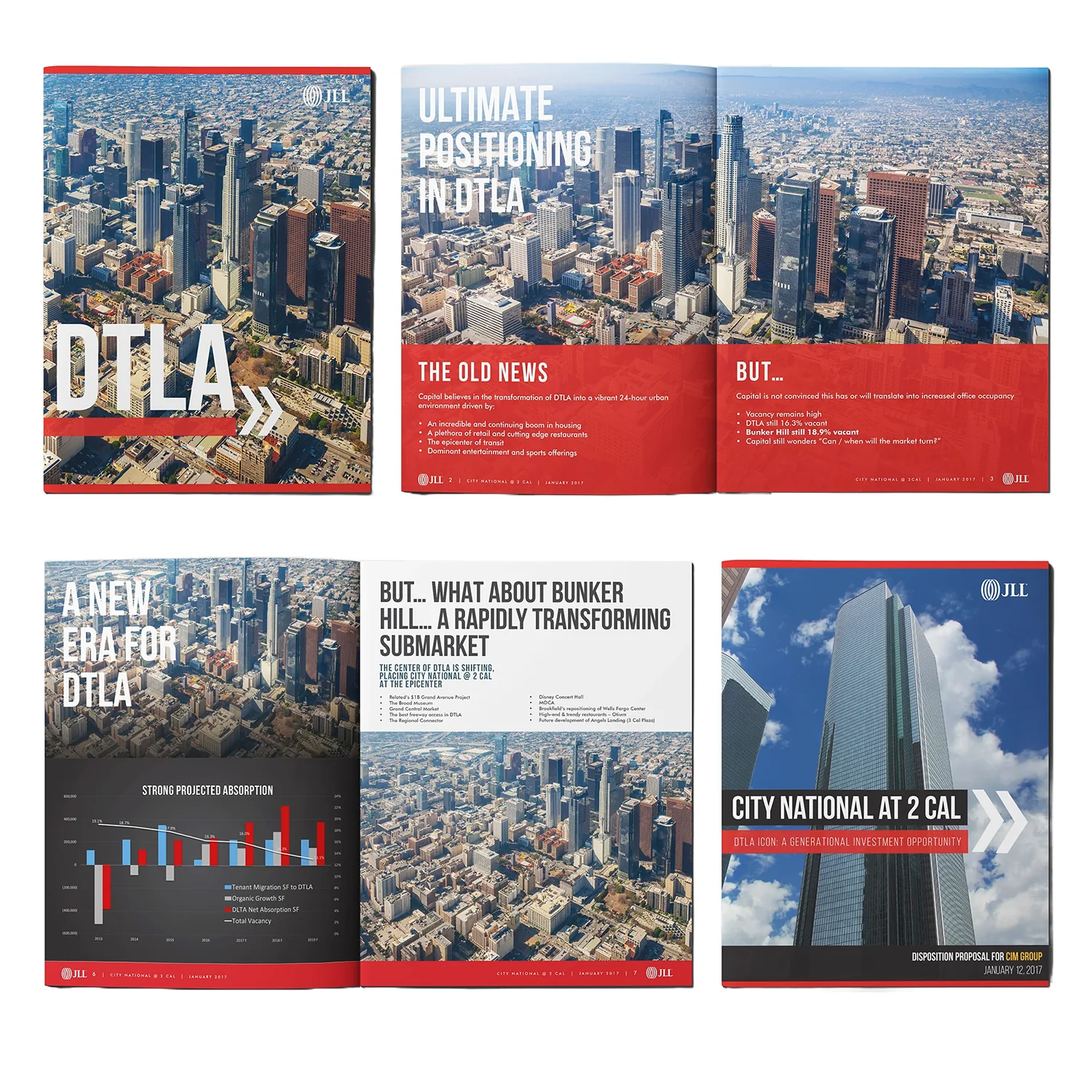
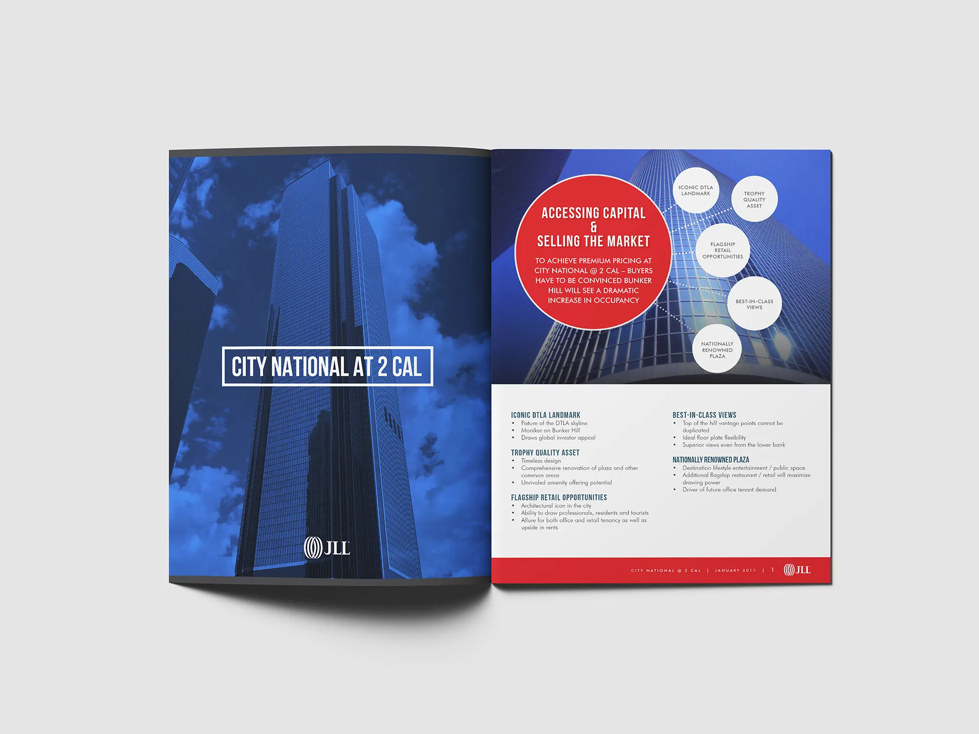
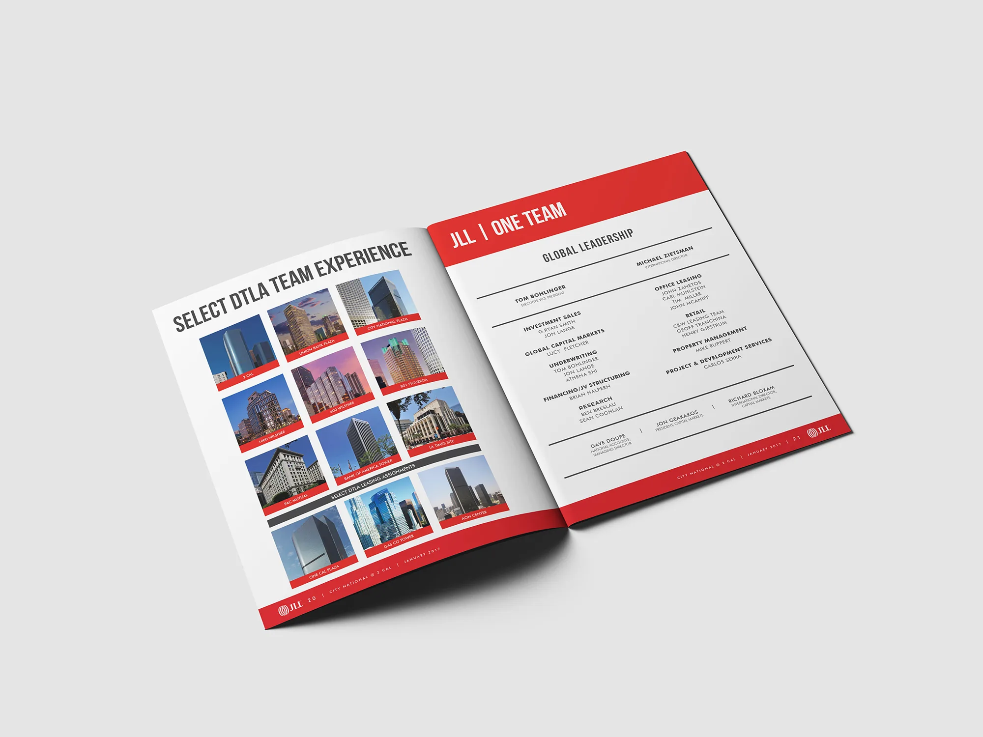
A DTLA landmark needed buyers to see what the vacancy numbers hid: a generational asset at the center of a transforming submarket. The proposal had to argue with pictures as hard as the brokers argued with words.
I designed the investment narrative: aerial storytelling, absorption charts that read at a glance, spread after spread building the case for Bunker Hill. Research became graphics. Graphics became conviction.
Work in this practice supported $1B+ in closed transactions. Design that moves capital is still design.


The Tonya Peek Group closed $63 million and earned a magazine page to prove it. The deadline was tight and the team photography wasn't. Shot separately, lit differently, never meant to share a frame.
Heavy compositing and color work brought thirteen people into one believable room. The layout let the number do the talking.
The client's words: it elevated their market presence. The page did its job, quietly and on time.

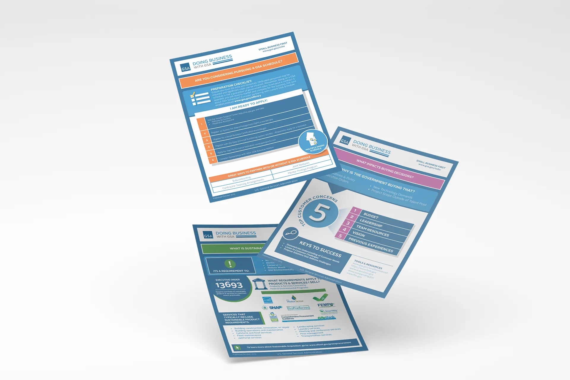
For the GSA, I turned dense federal procurement data into color-coded, 508-compliant infographic systems: clarity as a public service, accessibility as a hard requirement, not a checkbox.
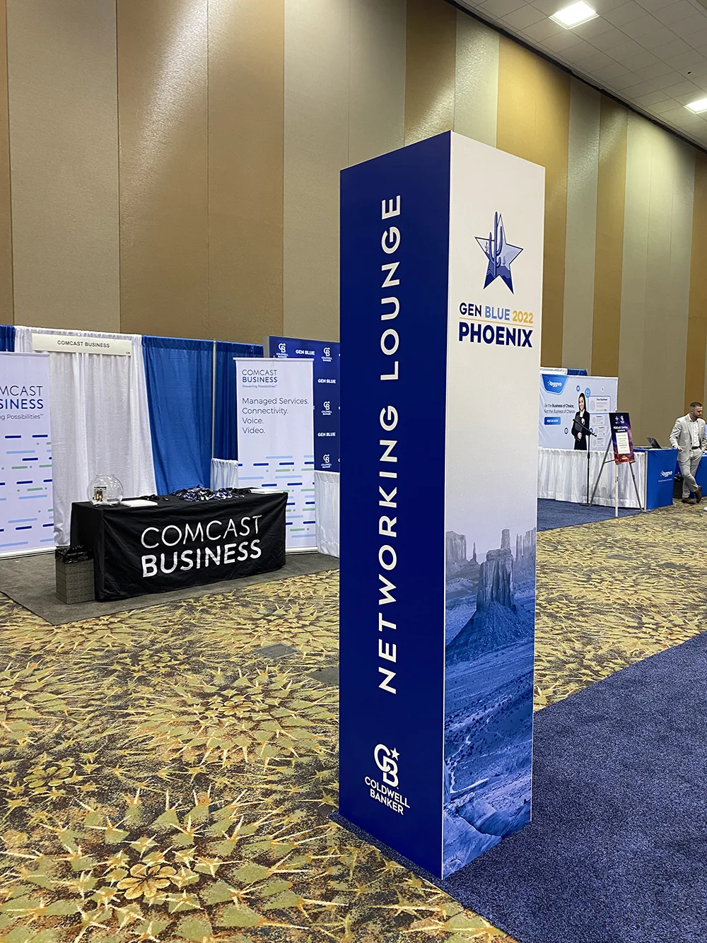
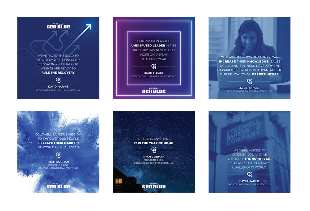
And for Gen Blue, Coldwell Banker's flagship conference, I helped shape the venue canvas year after year · signage, social, and environments, including the Phoenix edition, in the city I now call home.


Pixels with purpose: social at brand scale
Social for a national brand is a systems problem wearing a creative costume. Thousands of agents. Fifty markets. One voice.
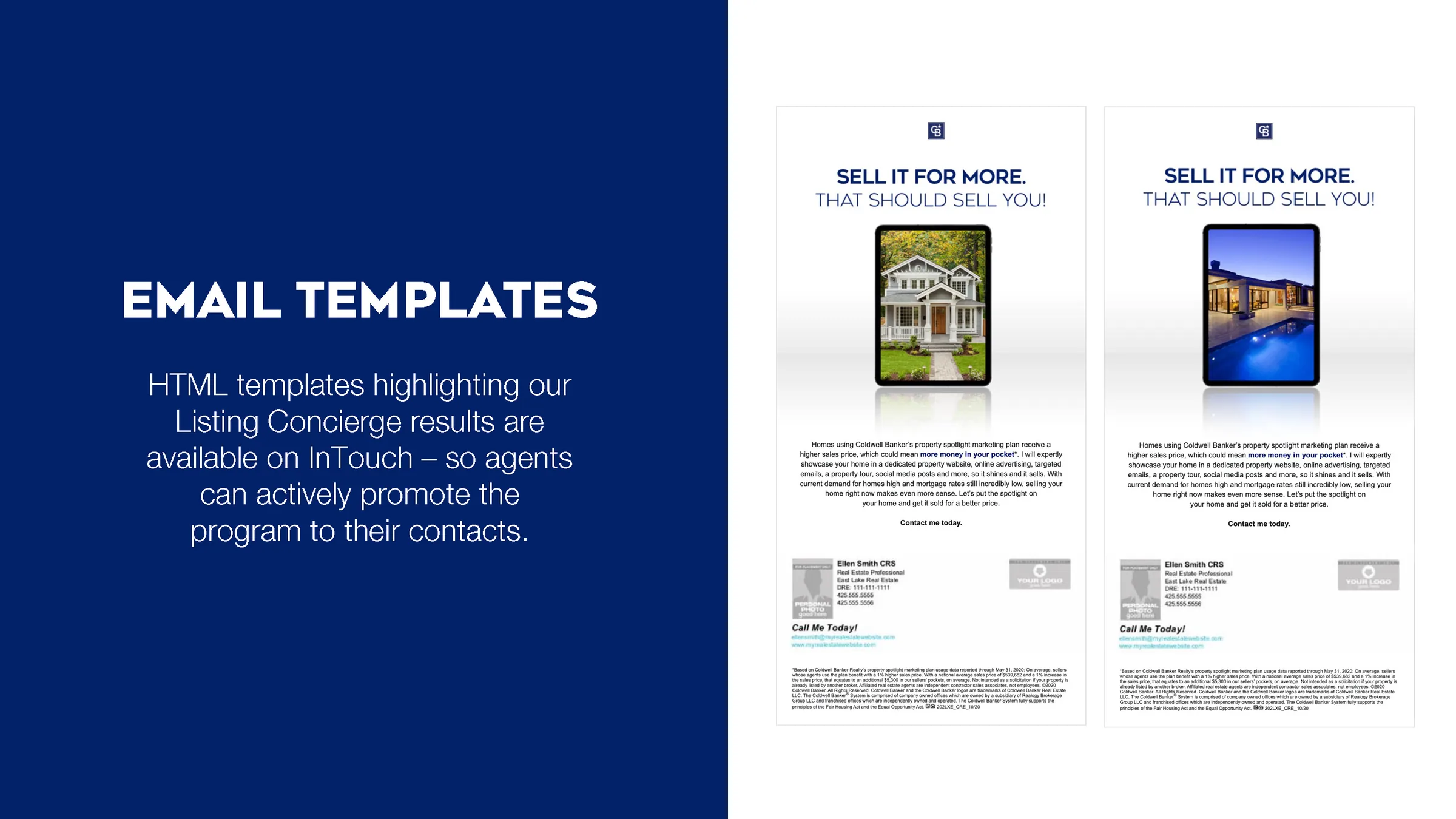
I designed campaigns across the spectrum: a fair housing series that led with people, market leadership stats localized city by city, and self-serve listing templates that let any agent ship on-brand work without touching a design file.
Flexible enough for an agent in St. Louis. Tight enough that legal never flinched.